This won't be hard because i won't have to change anything.

Like i said before nothing has to change, the only aspect i have changed is the size of the typography. Before the font size for the type was 9pt, which is the same type size as the type used on the opposite side.
The reason i changed it was to make it stand out a lot more, because this is a statement about the image used. I wanted to make it prominent so it has a reason to be there, rather than fading into the background. Another reason is the fact that it's a nice typeface, that works with the style of the restaurant.
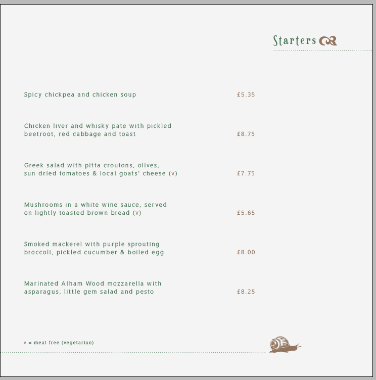
This is the opposite page, it's the same as the 2nd page. The only difference is the typeface i change it to WellRockSlab.
I prefer this typeface for the main body of type for the reason i explained before. About how it has a nice contrast with the headers, even though they're the same colour it works because of the typeface used and the point size of them both. I used 9pt on the main body of type, because it just makes it look a lot neater, if i had it on 12pt or bigger, i think it would have looked clumsy and also took the attention away from the title of the page.
I also made it 9pt to create space, because there is a lot of copy. This is the reason i made the paragraphs have a lot of leading, to increase the amount of space. I personally think it looks really neat and works nicely.

This shows how the menu would look like, i do like the look of it. Im pleased it looks like a real
menu. The only aspect i would like to play around with is the type on the left side, i was thinking about putting it in a different place on different places. Either higher up or lower down.
To make it look balanced i would keep it lined up with the type on the opposite page.

As an example these are the next pages including the mains, I have used imagery to relate to one or more images. Therefore the statement relating to the imagery will be different each time, the statement is also placed differently to the previous.
It still looks good so i will keep doing this throughout the menu, just makes the menu more edgy and interesting.
My menu also includes desserts, wines and cocktails and these will follow the same grid system and layout throughout, to keep it looking consistent.
No comments:
Post a Comment