Tuesday 29 March 2011

other items

These were really simple to put together, its all about to placing the logo onto other objects, so here we have a dinner plate.


I didnt want to use the logo for lettuce eat, so decided to use just the image that gives the brand its character. I think it works well, it still carries the simplicity used throughout the whole brand.
I also feel its just the right amount of design to use on a plate, otherwise it would start to look crowded and tacky.


The next aspect i have chosen is the napkins found in the restaurant.


Again the same colour scheme is used, with the same design to keep the consistency. It's very minimalist which i like anyway. I feel just little subtle touches like this just adds value to the over all product.


This is the mustard label for the homemade condiments, i've tried to impose it as best a could. I made it look like a label on top of a label, because i would have had to stretch it to make it fit. Therefore it would have looked all distorted and looked rubbish.


This is the possible look for the restaurant front, it may not be the final one. I just wanted to get an idea of how it may look.


Friday 18 March 2011

whats next?

I had many ideas of what other aspects i could design, e.g. wine bottle labels, direct mail, cutlery, condiment labels, restaurant front. etc.
I decided on the condiments labels and shop front as i'd already done wine bottle label and direct mail. I wanted to try something different. Which lead me onto plate design and napkins, which would be no problem in making.


I wanted to start with the designing of the food labels, as the rest is basically applying the logo or part of the logo to imagery.


I wanted the food labels to look as though they belonged and fitted in with the menu, so i used the same typography, colours and similar layout.


After producing the menu, creating food labels wasn't hard at all, it was basically using the same principles, just less content. I used the same 4 column grid system, making it asymmetrical to get a similar look to the menu. I used all the same colours, typefaces and dotted line for the footer. The only difference is the extra colour used in Tomato Sauce, just makes sense to use red because tomatoes are red, then used the green from the logo to keep it corporate.

I will use different colours for the titles of the sauce, so you can tell the difference between the labels, but to also link in with the colour of the sauce itself.


This shows the back of the label, the boring part with all the ingredients. To make it more interesting i increased the size of the green leaf and lined it up with the paragraph, just to add a bit more design to it.
All the colours are the same as the previous and i have used the dotted line with the snail, to reinforce the brand, and also to keep a similar layout to the menu.


I have produced mustard and salad cream labels to complete the set, they look exactly the same just different coloured titles. The corporate brown for the word english and a yellow/orange for mustard. A light green for salad and the corporate green for cream.


These labels will then be imposed onto an appropriate style style, i will upload this later on.

menu pages

Now i had a style for my menu, i just had to apply the style to the rest of the pages.
This won't be hard because i won't have to change anything.


Like i said before nothing has to change, the only aspect i have changed is the size of the typography. Before the font size for the type was 9pt, which is the same type size as the type used on the opposite side.
The reason i changed it was to make it stand out a lot more, because this is a statement about the image used. I wanted to make it prominent so it has a reason to be there, rather than fading into the background. Another reason is the fact that it's a nice typeface, that works with the style of the restaurant.


This is the opposite page, it's the same as the 2nd page. The only difference is the typeface i change it to WellRockSlab. 

I prefer this typeface for the main body of type for the reason i explained before. About how it has a nice contrast with the headers, even though they're the same colour it works because of the typeface used and the point size of them both. I used 9pt on the main body of type, because it just makes it look a lot neater, if i had it on 12pt or bigger, i think it would have looked clumsy and also took the attention away from the title of the page.

I also made it 9pt to create space, because there is a lot of copy. This is the reason i made the paragraphs have a lot of leading, to increase the amount of space. I personally think it looks really neat and works nicely.


This shows how the menu would look like, i do like the look of it. Im pleased it looks like a real 
menu. The only aspect i would like to play around with is the type on the left side, i was thinking about putting it in a different place on different places. Either higher up or lower down.
To make it look balanced i would keep it lined up with the type on the opposite page.


As an example these are the next pages including the mains, I have used imagery to relate to one or more images. Therefore the statement relating to the imagery will be different each time, the statement is also placed differently to the previous. 
It still looks good so i will keep doing this throughout the menu, just makes the menu more edgy and interesting.

My menu also includes desserts, wines and cocktails and these will follow the same grid system and layout throughout, to keep it looking consistent.


Thursday 17 March 2011

first designs

The following images shown below are the first initial ideas i have, taking into account what i have researched and what work i personally liked.


The front cover of the menu hasn't changed much only so it fits within the 4 column grid system. Apart from that everything else is the same, I like the use of space already. I've got a good feeling i've taken the right route.


This is the first page of the double page spread, ( it doesn't have the grey outline, i had to include that otherwise the white backgrounds would just blend) I did as i said i was going to do with the image over 2 columns, i personally think it is working well thats also because it's a good image.

The typography used at the side uses the same font as the logo, this is to keep consistency, but to also keep it separate from the menu itself, so people don't think is apart of the starters menu etc. I used the corporate brown colour as i will be using the green for the more important  typography, so this just creates a contrast.

To make it look a little bit fancy i used a large capital letter at the beginning of the sentence, I did this because i picked up that most fancy looking menus, booklets etc use this to make them look traditional. So used it because  i wanted my menu to look slightly traditional and posh looking.
I also used the dotted line running down the side of the page to keep in with the rest of the design, but also to stop it look like the typography is floating on the page. It holds all the design together.


This is the 2nd page of the double page spread, taking in what i have seen from other menus and booklets, i used the white space to my advantage. I looks neat but considered with the use of the grid system, the type from page one does line up with the first paragraph on this page, to keep it looking balanced. 
However to keep it looking slightly asymmetrical, i used the end column of the grid for the header, which again adds a lot of considered space. The footer with the snail is used to keep consistency, as i used it one the front cover. I just think it adds a uniqueness, but also just holds all the page together, stops it looking as if it's floating.


Its slightly small but this what the first 2 pages look like together, so far i think it's not looking too bad.


what an influence

I looked back at the fellow bloggers work, mainly to look at the grid system they used, so i could get a feel of what works and what doesn't.


What i particularly like about this double page spread is the that not all the columns are used and that there is a lot of space. It looks really modern and stylish, the same message i want to get across. The aspect i will be taking from this is the way the image is set in 5 out of the 6 column grid she's possibly used. I was thinking more along the lines of a 4 column grid and using 2 columns for the image.


This is another favourite page of mine, even though there is a lot of text, it is used in a controlled way and still works because of the white space. This is something i will have to consider as a menu generally has a lot of content. Again not all the columns are used, i love the asymmetrical look, just adds more interest.


This is another favourite of mine, i like the simplicity of it i am also swayed this way to the shape and size of the menu. As before i had it in a traditional tall and thin menu, however this made it hard to include most of the content and quietly frankly just looked naff.
Therefore i'm thinking the bigger the menu the better i will be able to get the space i need etc.


Wednesday 16 March 2011

fancy and traditional

I have established what style i want my restaurant to be, that is traditional and fancy.
So for my next step i looked at some existing traditional style menu's because the look of the menu with give the overall look of the whole restaurant.


However all i came across was bog standard looking menus that weren't designed particularly well at all, so they weren't any help. So i decided to play around with colour schemes and possible typefaces for the main body of text first, then hopefully see something that i thought would help to influence my layout/design in some way.


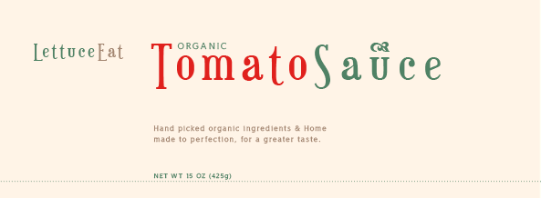
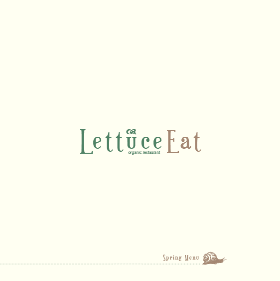
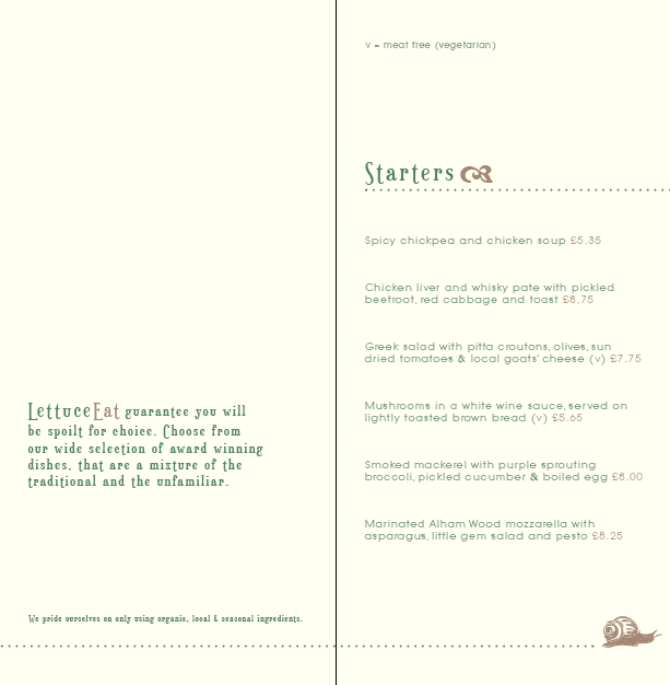
They colour scheme i have chosen is pretty straight forward, it's basically the corporate colours from the logo and they cream colour for the secondary colour. I chose cream because white was too harsh on the eyes, plus there wasn't a nice contrast of colour.

I have also included a snail within my design, because i wanted something to relate to the word lettuce, plus it also adds a modern twist on what will be a quite traditional style menu and though out the whole restaurant. 

Having done research into organic restaurants i found out they do a different menu for each season, depending on what locally produce they can source and vegetables they can grow.
So i have produced my menu for Spring, if i was to do the rest of the seasons then i would probably think about different colour schemes, but for now this one is working.


Below shows the next pages of try outs, focusing more on layouts and typography.


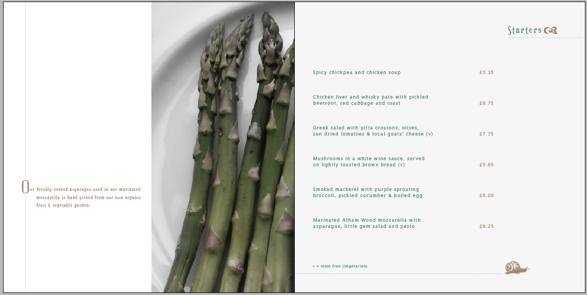
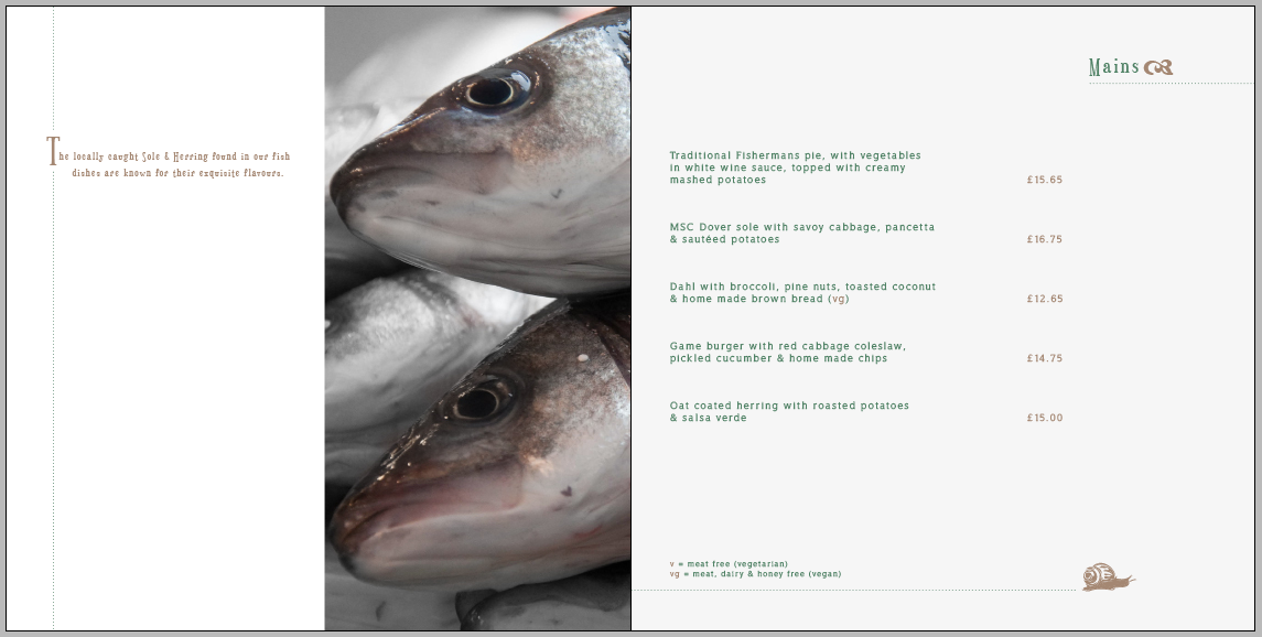
Aspects i like about this layout are use of space of the left hand side. I want my menu to look traditional, but have a modern feel. I like a lot of white space so will be using it throughout my menu and other aspects.

I have used the font from the logo for headings, to give more emphasis on the word to make it stand out. I also like the font being used for information about the restaurant, so it separates itself from the menu. I may even make it more prominent, so there's more contrast between the type used for the menu information.

I also like the dotted lines used almost like a header and footer, it just adds some design to the menu. I will be using this in my menu design, i also like how the dotted line keeps consistency through the design, because it was used on the front.

I'm not too keen on the sans serif typeface used for the menu information, it doesn't really fit in with the other typeface used for the headers. I think a serif would work better, but not as formal as Times New Roman. 

I did find this font though from Da Font, that i thought would work a lot better. It's serif but has a softer feel, it's a modern sans serif which will fit into the over all style.


WellRockSlab is the name of the typeface below, that i think will work better than the previous. It has a nice comparison with the other typeface used, plus it's more modern.


I like the softness of this typeface, as it's a mix between both serif and sans serif in a way, it has the roundness of a sans serif, but the flicks make it serif. I will see if this typeface will actually work, when it comes to designing the really menu.

Now i have an idea of what colours and possible typefaces i will be using, time for inspiration.


Friday 18 February 2011

development and alterations

I didn't really like the look of the font with reduced kerning, i just didn't think it gave the right look.
As i have always used reduced kerning on all my typography, i thought i would try something new, same with using a serif typeface.


Below is the original, just as it comes:


And then there's my version:


By using capitals not balances the whole thing out, (because before the letter T's made it look a little bit of a jumble) but it also helps the audience to read it a lot easier, if i didn't make the letter E on eat a capital both words would merge together and wouldn't be as easy to understand, because of the same colour used. However i will be using a different colour, more earthy colours to show that it's an organic food restaurant.


Now to add some colour, i will be using more warmer shades this time rather than the washed colours shown previously. I like the idea of using to separate colours again for each or the words like before. Doing it this way again makes it a lot clearer and easier to read.


For the colour scheme i wanted to choose colours that complemented each other, rather than to serve the purpose of separating to words.
Sticking to earth colours, made it a lot easier to fit colours that worked well together, as everyone thinks of greens and browns.
The colour contrast works really well with these colours, i will be keeping this colour scheme and will consider using it through other means, such as menu's, napkins etc.

I still think it needs a little something extra to make it look more classy, i kind of fell across this by accident as i was searching for symbols, i came across a fancy looking leaf on wingdings that i thought would work nicely.


I just finishes off the logo and adds a uniqueness to it. I have also included a sub title of organic restaurant to be used on shop fronts, menu etc. but could work without if necessary.


Now i have a logo, what to do next?


is this The One?

Dafont.com is most useful when searching for a specific font style. After searching through the number of pages that included serif fonts, i thought i would have to change my font style all together to sans serif, because i couldn't find anything that caught my eye.


However i found one that made me stick with using a serif:


Euphorigenic 


I really like the quirkiness of this font, it's a fun looking serif with the letter T's hanging lower than the rest. This just adds something a bit extra to the font, i also like the curls at the end of the A and C, again quirky but fits exactly what i was looking for.

A font that had a serif, but wasn't to harsh more soft, slightly rounded. GREAT! 
I also like how it carries a similar look to the previous font.


On the look out for fonts

I knew what type of serif i wanted to go for, which made it harder for me to find one that i liked. 
I didn't want it to do too harsh like Times New Roman, but i wanted it do be quite soft and a more rounded serif. As i couldn't find one that suited what i was looking for, i decided to look on DaFont.com, to see if could offer me anything, that caught my eye to be suitable.


I came across:


VTKS Estilosa, which looked like this.


I did like the look of this typeface, it fitted nicely with what i was after. I also thought i would work well in the earthy colours. However i didn't just want it to be on it's own, i wanted either a symbol or logotype to accompany it, as i thought it would look boring on it's own.


Below is a developed version:


After using colours and adding a fancy looking leaf, i decided this wan't the right font to use.
I don't know wether it's the colours i've used that make it look washed out, or the fact that the font itself is too thick to use with the leaf. As it doesn't seem to flow nicely, i would rather the leaf be on its own somehow and be made a feature. 
The font is far to chunky and more childlike, than for a fancy upmarket restaurant.

I personally think the font used will be crucial to how the restaurant is perceived, so it needs to be aesthetically pleasing and reflect the theme of the restaurant.


Tuesday 15 February 2011

Hold Your Horses

As i haven't got a clear view in my mind on what the logo for my restaurant will look like, i wanted to look at some existing organic restaurant logos for inspiration.


I know i want my logo in a serif font, preferably with green/earth colours and a connection to the environment through an image, e.g leaf, stem, green swirl, etc. 


Below are a few logos with my ideas in mind:


I think its clever use of imagery, turning the fork into a tree, however the styling just wouldn't fit into the style i see for my own restaurant. The colours work well together, however i don't like how typography is lined up, organic food needs to be moved slightly to the right.
It probably works for the company it's portraying, but not the style i'm looking for at all.


I like the look of this font, it's very similar to the font used on the 'item' restaurant. However i feel it is let down by the image of the leaves. It makes it look cheap, it would have worked with  just the name. I will be taking into account how the stem flows off the letter g, i think this works ok with this particular font as it has nice serifs. However if it was an ordinary serif typeface such as Times New Roman, it wouldn't have the same effect as the serifs on that are straight.


Below depicts the same company just with different logos.
Out of the logos i have shown i like these ones the most, as they fit better with what i am after in terms of my own logo.


This is the first of two logos for the same company. The first aspect i am drawn to is the logotype, just because it includes the only bright colour. The colour also reinforces the name of the restaurant and the fact it's a leaf. I like the logotype, but i feel it's a little fussy and over powering compared to the typography used.
I like the font that is used, even though it's a serif typeface it still has a modern feel. Although i think it could have done with being a bit bolder to match the weight of strokes used on the logotype, as it seems to fade to the background because the logotype is bold.


This is updated logo for the green restaurant and i love the transformation! This has to be my favourite logo out of all of them shown, just because of its simplicity and use of colour.
Using the colour green for the word green works so much better than the previous logo, the name stands out a lot more which is just common sense.
The typeface used also suits it a lot better than the previous typeface, even though that one had potential also.
And last but not least my favourite part, the logotype. I love how the wine glass is made into a fork, it's quirky and memorable but also reinforces what the restaurant has to offer the customers. The leaf used is in it's simplest form, which echos the simplicity of the whole logo.
I love everything about this logo, and it shows that less is more when it comes to logo design.

After looking at the logos i have analysed, i will take into consideration what makes a good logo and what makes a bad one, so i can create a good one for my own restaurant.

Lettuce eat in style

Now i had my name, I had the theme of restaurant nailed. 
Keeping the name in mind, i decided on an organic themed restaurant, that uses both home grown and locally sourced produce within the courses.
The target audience will be 30-50yrs, aimed more for the mature and classy diner.


I want the restaurant to look classy and posh, so i'll will be going for a serif typeface for the name of the restaurant. I am a little dubious about using a serif, as i never have done before because i like modern, contemporary type. By using a serif is out of my comfort zone, but it's the only way to make my restaurant look more traditional.


Let the challenge begin.


names round two

I still wanted a quirky name for my restaurant, but now my choice is endless. 
I didn't really know where to start, so looked good restaurant names, however i was bombard by funny ones instead these where just a few:


There were others for other themed restaurants e.g  'Balti Towers' for an Indian restaurant and 'Pizza the action' for an italian. Both are really cheesy, but a great play on words and thats when i came up with my name.


I really don't no where it came from, just thinking of what people do in restaurants and i played on the fact of eating. Taken from what the vicar says in church, let us pray, but i twisted it to let us eat, trying to give the impression my restaurant was a place to worship food.


It then hit me, that let us, sounded like Lettuce, so in the end went for the name:
                                         'Lettuce Eat'

A fellow blogger

Whilst researching, class mates and I came across another graphic design student on blogger how had already done the mutton quad brief. 
They had taken the brief a completely different route to what i thought was expected from what the brief was asking.


Instead of naming the restaurant something to do with typography, they have focused on using typographic styling with the name. Which i think works better than the approach i was taking, the theme of the restaurant is asian fusion, which is depicted through the colour of the title and it's a speed dating restaurant, hence the name of the restaurant.

This has now made me feel more confident about the brief, i will now decide on a better name  for my own restaurant.

standing at the beginning

I decided on the word Initial for my restaurant, as i thought it sounded classy and the restaurant could be quite traditional.


Looking at the meaning on wikipedia, gave me an insight into what it meant, the word is derivedfrom the latin initialis, which means standing at the beginning.


Used in the first Greek texts, this gave the idea of making my restaurant greek style with the used of decorated initials at the beginning of paragraphs. However i feel the idea is slightly forced and not what i will enjoy doing, so i will think of alternatives.


Back to the drawing board.

names

As the restaurant has to be typographical themed, i was thinking of calling my restaurant a quirky name to do with type.


I was thinking of all the typically names such as:
Capital
Italic
Serif, etc


I just thought that they were the obvious choice and tad boring, so i decided to look deeper and at typeface/typographer, but even then nothing was really jumping out at me, all to boring or just didn't do it for me.

the chosen one

None of the ISTD brief's really stood out for me, so by re-reading them, the mutton quad brief was the only one that seemed appealing. As it was branding i felt confident enough to do it after Yo! sushi, however this time it was up to me to choose the target audience, styling etc. I will try and get it as far away from the Yo! sushi look as possible, for variety in my portfolio.

Lets get to it then.